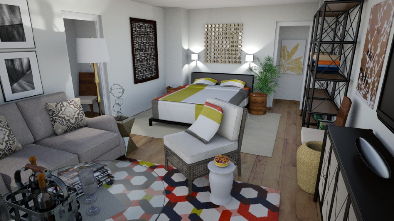
When you walk into a room that you absolutely love, you might say to yourself, “This room is so well decorated!” It seems that if we just took the colors, patterns, pillows, and accessories for that space and put them in ours, we would have a well-decorated room, too. What many of us don’t realize, however, is that the room is more than just decorated. It creates a Sense of Space.
Creating a Sense of Space is the most basic idea of interior decor. It is so basic, in fact, that almost no one talks about it—including decorators! So what is it?
A Sense of Space is actually a careful balancing act. Rooms we love give us a feeling of welcoming and arrival. They also offer a sense of privacy and protection from the outside world. But those feelings are balanced with a sense of freedom and relaxation, a feeling of not being confined. Almost all of the Roominess videos and articles start with this concept. Let’s walk through several of my most frequent recommendations and talk about how they relate to a Sense of Space.
Floating Furniture Arrangement
What I’ve noticed in many unsuccessful rooms is that they try to maximize space by shoving all the furniture up against the walls. A room like this seems smaller because it feels like there’s not enough space for the furniture. (Sometimes this is necessary in particularly small rooms. Have a look at this video.) It also feels smaller because empty floor space in the middle of the room doesn’t add much functionality. Unless you’re giving dance lessons or hosting cocktail parties every week, large expanses of floor space don’t do you much good.
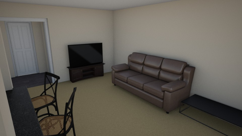
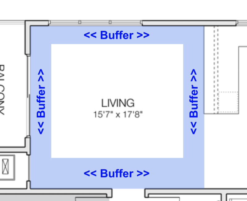
Have you ever noticed the paradox that an empty room seems larger after it’s been furnished? This is a common reaction. With an empty room, we only have the walls to look at. My unscientific explanation of this is that our eyes go straight to the limitations—the lines at the corners of the walls floor and ceiling—and easily trace the outline of the space that’s confining us. An effective arrangement of furniture and art in the space distracts our eye from the confining walls and gives us a sense of gathering in a restful spot.
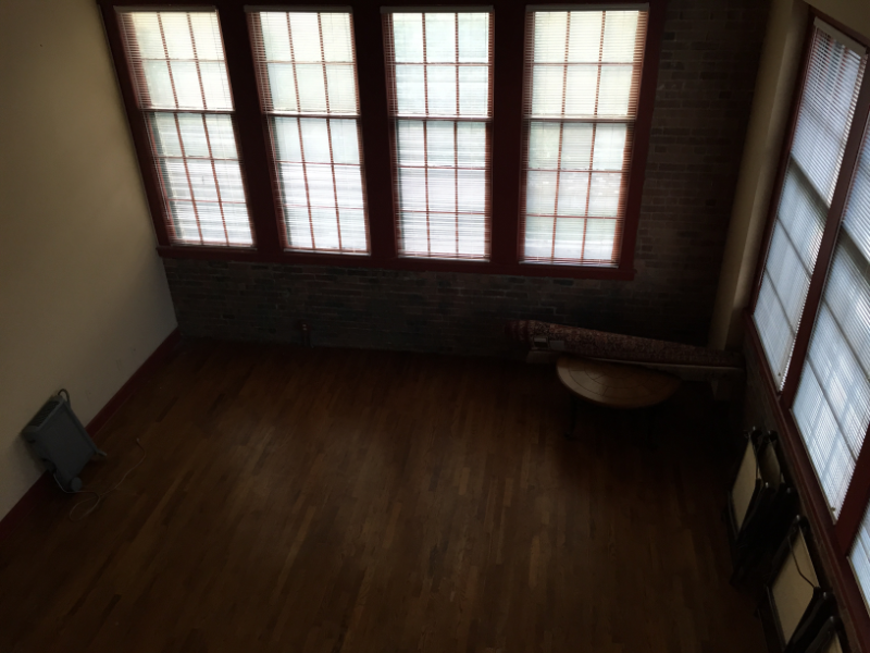
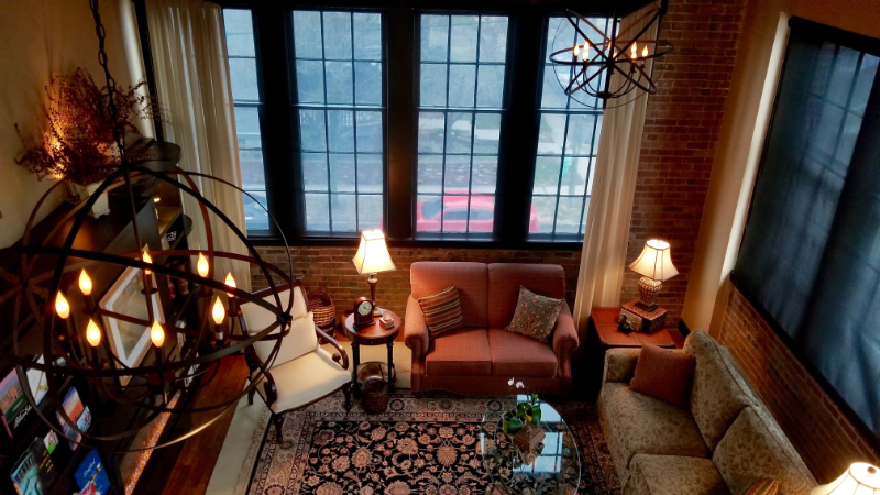
So how do you create such an inviting ambience? In a seating room, the arrangement of the furniture is the first thing that can help your sense of space. Pull the furniture away from the walls and arrange it in or near the center of the room. When furniture is detached from the walls, we call it “floating.” This draws attention to the space you’ll actually be using and takes the focus off the walls, which can feel confining. You can also use floating furniture arrangements to push foot traffic out of your conversation area. This gives you and your guests the comfortable feeling that you’ve arrived at a resting place off the beaten path, so to speak.
Focal Points
Well-defined focal points also help with creating a sense of space. Some examples of focal points include picture windows (with or without a great view), a fireplace, a bookcase or entertainment center, a large piece of wall art, or even just an accent wall.
Which brings us to another paradox: Focal points are often on the wall! So how do they distract us from feeling like the wall’s closing in? (Paradoxical statements: one reason decorators don’t like to talk about the details of their process!)
Focal points draw attention to the center of the walls rather than the corners. A good focal point can be simple and stunning (think modern art), or it can be more complex, with lots of nooks and crannies for your eyes to explore (picture an ornate fireplace).
As a thought experiment, imagine one of the rooms in your home is a gallery in an art museum. How would an art museum use the space? Here’s an example I made for a fanciful alternative to a dining room:
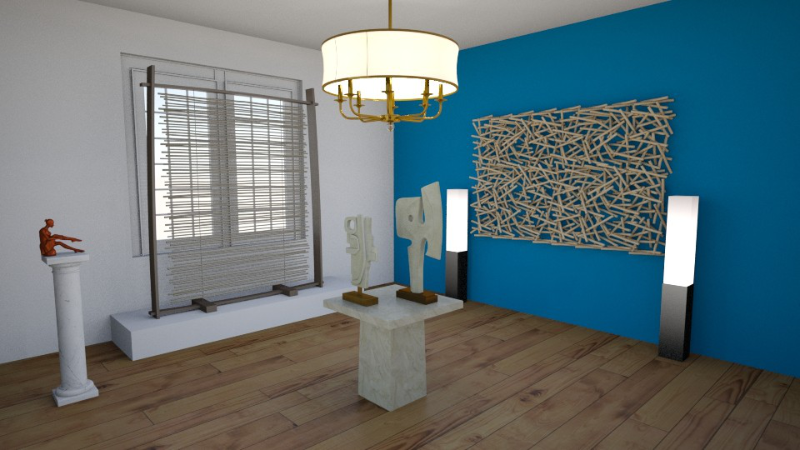
Like an art museum, the idea behind this arrangement is to draw so much attention to the art that walls don’t matter.
Another way to look at focal points: movies. The characters and the story are what you pay attention to, not the set. Even in the most elaborate movie sets (think of any Harry Potter or Star Trek movie, for example), the action in the foreground still captures your attention more than the set in the background. Creating a sense of space means pulling the focus where you want it.
Storage Pieces as Focal Points
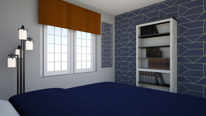
I mentioned bookshelves and wall units (entertainment centers) as potential focal points. The benefit of these pieces is that they stop your eye before it gets to the wall by creating a narrow—but effective—buffer, drawing attention to an interesting array of books or accessories. All the pieces you can collect and display on your shelves are the real fun. In a minimalist home, you might go for fewer and more striking pieces—similar to the art museum example above. If, like me, you’re not a minimalist, shelves can be a place for not only books and baubles, but art, sculpture, plates, antiques, boxes, baskets, dried flowers, and greeting cards. Collections on each shelf create little vignettes or stories that function as eye candy to keep everyone’s gaze from drifting back to the wall itself.
A bonus tip for storage pieces: The more ornate your bookshelf or cabinet is by itself, the simpler I would keep your accessories. Adding lots of clutter to an ornate piece tends to look busy rather than interesting. Storing or displaying plain white dishes in your grandmother’s hutch, for example, allows the intricate craftsmanship of the antique furniture piece to take center stage.
Lighting
One of the worst decor ideas in home building since the advent of electricity has been the central ceiling light fixture. This fixture tends to blast all the surfaces under its gaze with harsh and overly bright light that pulls your focus to the room’s limits—the walls, floors, and ceiling. All are places you don’t want to draw attention!
To create a sense of space with lighting, bring the light into the space. Arrange table and floor lamps around your conversation circle. (To learn more about conversation circles, take a look at this article.) Triangulate your lamps so that two are in front of every seating location. This casts an even amount of light on all your guests. Lamps bring the light down to head-height, which is more pleasant than light from above.
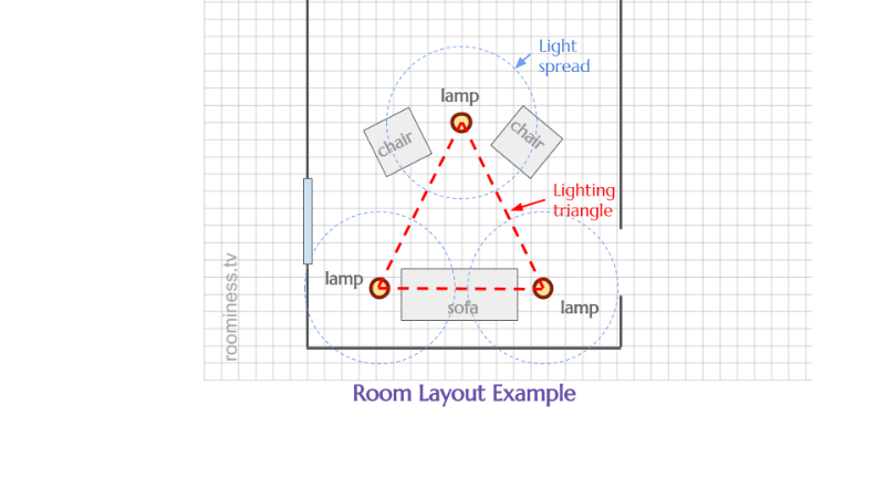
At this point, you might be wondering: but decorators use lights on walls and ceilings, don’t they? They do indeed. However, you rarely see them accomplish their lighting with a central fixture. They wash the walls gently with an indirect (hidden) light from the bottom or top. They also use recessed lighting in the ceiling to focus attention on the focal points of the room. The professional lighting industry is good at making rooms look attractive with these methods, but they’re expensive. Personally, I find lamps to be a better overall solution, because the lamps themselves add artistic interest to the room.
I wrote an entire ebook all about lighting that you can find here.
Walls, Floors, and Ceilings
As much as I want to encourage you to pull the focus away from your walls, the room surfaces (walls and floors) don’t have to be uninteresting. When I moved into a condo with exposed brick walls, it was a dream come true for me. I’ve seen lovely rooms decorated with wall treatments such as painted murals, paneling, or fabric hung from rods.
I didn’t mention the ceiling, and that’s intentional. The way we live in our homes, and perhaps just our cultural conditioning, cause us to not look at ceilings very often. In homes, they’re usually painted a plain white. Unless you’re going for a very specific look (coffee shop in your living room, anyone?), I would leave the ceiling white and focus your decorating budget elsewhere.
As with anything in decorating, you have infinite options for finishing the walls and floors as well as mixing and matching colors, darks and lights, and feature walls or focal point rugs. I approach those decisions with an eye toward mood and room proportions, which are different discussions. For the purposes of creating a sense of space only, here are a few generalizations I’ll make:
- Rugs instantly define spaces. A rug of any type or color within a room creates a visual boundary around it that helps the room feel less confined by the walls.
- A low-contrast, uniform color palette across the walls and floors makes a room feel warmly enveloping rather than constricting. Whether you prefer light-and-airy creams, medium-warm grays, or dark wood-tones, an even palette across your room will make it feel harmonious and draw everyone’s attention to the focal points—the furniture, art, and people—not the walls.
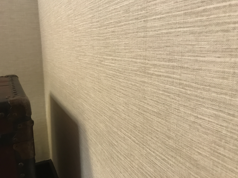
- Textures on your walls and floor, even subtle ones, “blur the lines” of the walls themselves. A surface that doesn’t appear quite flat adds to the feeling of a buffer between you, the room occupant, and the wall that’s defining and confining the space.
A couple of extra resources for you:
- On the subject of color: when you sign up for my newsletter, you’ll also get my free ebook, which offers a bunch of tips on how to use color in your home decor. See the email signup on this page!
- I talk more about scale and proportion in this video.
Give Your Eye Something to Do
I’ve mentioned several times above that you want to distract or stop your eye before it gets to the walls or corners of the room. Let’s compare that idea to rooms from yesteryear.
In older styles of architecture, say 1930’s and prior, it was common to have woodwork and paneling that covered the walls. Substantial floor and crown moldings had multiple layers and finely routed details. Many people still love this kind of detailing. One reason is that the woodwork gives the eye something to do. Instead of focusing on the limit of the wall or the corner, we get lulled into the beauty of the molding. Often this process is completely unconscious.
Another traditional example of fooling the eye is religious architecture. Greek and Roman temples and Catholic cathedrals all very commonly feature a colonnade along the main nave of their interior. As you enter, you don’t see walls on either side of you. You see columns blocking your view. So the space continues to change and reveal itself to you as you move through it.
A Brief Aside on Molding and Trim
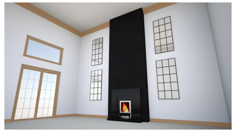
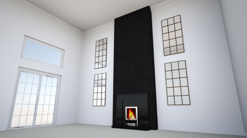
Many people do not like small, dark moldings on white or very light walls. A common culprit is a newer large home with small oak moldings throughout. The end result is not attractive because the moldings are too plain to give the eye something to get caught up in. Instead, they have the opposite effect of drawing a dark line to delineate the corners of the room as if announcing, “Here is the size of the box you’re in right now.” This is the source of an ongoing argument between those who love stained woodwork and decorators who want to paint it. The woodwork lovers give a pass to this outlining issue and only see the stained wood itself as a beautiful thing to keep. Decorators see the outlining issue (which they may or may not identify directly) and recommend painting the woodwork white so that the overall room background can recede and other focal points take precedence.
It Takes Time
For most of us, it takes time to put together a room that truly creates a sense of space, because all of the techniques above affect the overall ambience. Buying full rooms of furniture can be expensive, and it can take months or years to find the right mix of long-lasting pieces. Sometimes we have to live with our furniture pieces for a while before we discover the right combination of wall coverings, floor finishes, and rugs to accent them. Although you could go on a shopping spree to buy accessories for all your shelves and tables at once, I prefer to collect and curate accessories and art over time. A curious alchemy begins to take shape between the owners and the decor in a well-curated room. Part of the sense of space is a feeling that a room truly reflects its owner.
When you add all these elements together, you compound their ability to give a room a real sense of space. Your room becomes a place you want to spend time, rather than someplace you want to escape from. Layering all of these ideas takes time and planning, but the result is well worth it!
Try This At Home!
Does your home feel like it has a sense of space, or does it just feel like walls that you live between? Let me know what you think of the ideas above. Or give them a try and let me know whether they worked for you!
If this all feels too daunting, not to worry! You can go back to the basics with this article.

